10,000 search results
(0.019 seconds)
- Accord by Soneri Type,
$39.00 The main difference between Accord Alternate and Accord is in the way curved strokes join with vertical stems in letters such as "bpn".
 - Acorde by Willerstorfer,
$95.00 Please note: Acorde webfonts are exclusively available at willerstorfer.com Acorde is a reliable workhorse for large, demanding design projects. It was designed to be perfectly suited to all different sizes, from small continuous text to large headlines and big signage. The typeface’s name is derived from ‘a’ ‘cor’porate ‘de’sign typeface, however Acorde is not only suitable for corporate design programmes but for information design and editorial design purposes as well. Acorde’s inception was in early 2005 as Stefan Willerstorfer’s final project in the Type and Media course at the Royal Academy of Art in The Hague (NL). It is a humanist sans serif with noticeable diagonal contrast and shows clear influences of the broad nib pen, especially in the Italics. Acorde’s characterful details give it a distinctive appearance in large sizes and contribute to its high legibility in small sizes. It comes in 14 styles – seven weights in Roman and Italic each. While the proportions of the Regular style were chosen to guarantee optimal legibility without being too space consuming, the heavier the weight gets the more suitable it is for headline purposes. The heavy weights are relatively narrower than the lighter ones, which gives them a strong appearance. The huge character set contains 925 glyphs per font and covers a vast range of latin-based languages. Various accented letters, small caps, eleven figure-sets, superscript and subscript are all included. OpenType features allow for a comfortable use of the large set. Acorde was honored with the 2010 Joseph Binder Bronze award for type design by DesignAustria.
 - Accord Alternate by Soneri Type,
$48.00 The main difference between Accord Alt and Accord is in the way curved strokes join with vertical stems in letters such as “bpn”. The Italics are designed at an italic angle of 10 degrees. All the letter forms have been kept similar while designing italic instead changing the form e.g. 'a' remains same double story in italic also instead changing it to single story. The intention is to keep it simple and neutral which helps communicate the corporate sense of professionalism.
 - Accura by dooType,
$15.00 Accura is a sans serif font with a technological aspect and simple letterforms. Its closed angles and smooth curves make it an unique source of personality, and still offers great readability. Perfectly fits to headline sizes and text blocks, Accura has seven precise-calculated weights and their matching italics, from thin to black. Offers support for more than 50 languages and count on opentype features.
 - Ancora by Ixipcalli,
$30.00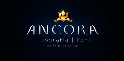
- Accolade by URW Type Foundry,
$35.00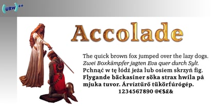
- Ancora by FAEL,
$20.00 I’m happy to announce the complete version of Ancora, a typeface I designed back in 2013. Ancora is a sans serif typeface with a distinctive style, inspired by the imagery in the production of the famous Port wine, such as boats, barrels, grapes, and bottle labels. Use Ancora for magazines, packaging, posters, stamps, brands and logos a new taste.
 - Bolded by We Make Font,
$16.00 Bolded is a new complete type family, designed and developed by creative professionals. Contains geometric and rounded features, optimized for both long texts and small screens and texts. The complete family offers seven weights divided between the basic, italic, condensed and condensed italic family. Created in 2022, Bolded has a modern and functional look, designed for the most diverse uses and projects. Bolded is a geometric rounded family that can meet the needs of the most varied professionals looking for a clean and elegant font family with a wide set of Latin characters.
 - Bolde by Figuree Studio,
$18.00 Bolde is a powerful sans serif font family with modern touches. A balance of hard lines and smooth curves makes them able to stand on their own dynamically Features: five all caps font, Numbers & Punctuation / Extensive Language Support Bolde works great in any branding, logos, magazines, film. The different styles give you the full range to explore a whole host of applications. Thanks for having a peek at Bolde. As always, if you have any questions just send me a message!
 - FarHat-Acordes - Unknown license

- Chord by Identikal Collection,
$23.00 - SF Old Republic - Unknown license

- SF Old Republic - Unknown license

- SF Old Republic - Unknown license

- SF Old Republic - Unknown license

- Golden Record by Mans Greback,
$59.00 Golden Record is an elegant all caps sans serif typeface with a tall, classic, and high-quality feel. Its timeless design is perfect for adding a touch of sophistication to any project. The font's classiness evokes a sense of luxury and opulence, making it ideal for high-end branding and design applications. Golden Record is a versatile typeface family consisting of the styles Light, Regular, Bold, and Outline, each available in Italic, offering a wide range of creative possibilities. The idea for Golden Record came to life when Mans Greback was inspired by the elegance of vintage vinyl records and their iconic gold labels, merging classic aesthetics with modern design principles. Mans Greback is a Swedish typeface designer known for crafting high-quality fonts with a focus on versatility and aesthetics. He created Golden Records to provide designers with a unique and sophisticated typeface for upscale projects. Greback is committed to delivering exceptional quality in every font he designs, consistently pushing the boundaries of typography.
 - Accolade Serial by SoftMaker,
$-
- Accolade EF by Elsner+Flake,
$35.00 - TS Accolade by TypeShop Collection,
$24.80 - PM Alcorn by Paper Moon Type & Graphic Supply,
$17.00 A new font inspired by classic retro and mid-century modern interlocking hand-written typography. Do you need to create some fun snack packaging to stand out on the shelf? PM Alcorn will quell your appetite. Are you designing a product that needs a funky, friendly retro vibe? PM Alcorn is fun, funky, friendly, and easy to read! It's perfect for everything from games to bath products. Plus with tons of ligatures and stylistic alternates it has real hand-lettered feel.
 - Cord by Roland Hüse Design,
$20.00 Cord (Zsinór in Hungarian) was originally a commissioned work for a tablecloth pattern with a thread like frame decoration that is actually consist of letters. The lettershapes were being created based on Rovas characters, which were reinterpreted without decreasing legibility. Therefore, the Rovas alphabet was designed in the first place followed by its matching Latin company. The full character set contains: Western, Central and South Eastern European Latin characters basic symbols and punctuation Rovas alphabet Rovas number symbols and punctuation Display font, best fit in larger sizes for souvenirs, folk art theme, embroidery, ribbon like decorative texts and signages. Good luck and Happy Creating! Roland
 - SF Old Republic SC - Unknown license

- SF Old Republic SC - Unknown license

- SF Old Republic SC - Unknown license

- SF Old Republic SC - Unknown license

- SF Old South Arabian by Sultan Fonts,
$9.99Historical Background Old South Arabian Script (OSA) was used before the Islamic era not only in the southwest corner of the Arabian Peninsula, but actually in the entire Peninsula. In addition, samples of OSA have been found as far as Uruk in Mesopotamia, Delos in Greece, and Giza in Egypt. Archaeological finds show that as far back as the 8th century BCE, OSA was used in trade, religious writing, and in civil records. Following the spread of Islam in Yemen, the decline of OSA began in the 7th century CE as it was gradually supplanted by Arabic script. OSA was typically known by the name of the then-dominant peoples in the Southern Peninsula. At various times, it was known as Sabaean, Qatabani, or Hadramite, among others. Although it was used for a variety of languages, OSA is most strongly associated with Sabaean. Many Peninsular languages borrowed OSA before introducing further changes of their own. Prime examples are the Thamudic, Safaitic, and Lihyanite scripts which eventually developed into independent scripts. The westward migration of the Sabaean people into the Horn of Africa introduced the South Arabian consonantal alphabet into the region. The transplanted script formed the roots of the Geez script of Ethiopia, which, in time and under presumably external influences, developed into a rich syllabary unlike any other Semitic script in history. Even a cursory examination of the letter forms of Modern Ethiopic writing reveal a striking similarity to South Arabian Script. OSA inscriptions typically reveal a dominant right-to-left directionality, although there are also many cases of alternating directions, known as boustrophedon writing. Figure 1 is a fine example of this style of writing. OSA inscriptions were discovered early in the 19th century. Soon thereafter, two orientalists, Gesenius and Rödiger, made great strides towards deciphering the script. Styles of Writing Old South Arabian inscriptions have survived primarily on stone, ceramic, and metallic surfaces. Hundreds of artifacts have been found and, to this day, continue to be discovered. Some of the best examples number of inscriptions on softer materials, such as wood and leather, have also been discovered. Although there is a significant difference between the styles of letters on the hard surfaces and those on the soft. Old South Arabian (Musnad) is composed of 29 letters , that is one letter more than the Arabic alphabet, which is between “S” and “Sh”, and names “Samekh”. Aspects of difference between Musnad and the present Arabic writing is that Musnad is written in separate letters, and the shape of the letters do not change according to its place in the word. However, some letters change according to the beginning of the writing. Musnad is either prominent, or deep. Prominent writings are for important writings and deep writings are for ordinary. The material on which the Musnad was written were stones, rocks, wood, and metal. In the course of its development the Musnad use appeared in the “Lehyanite’, “Thamudic”, “Safaitic”, pen to which many changes and amendments were made. And from it “Habashi’ writing was born. As regards his place among the Arabs of the Peninsula , when we look at the internet and its role in cultural dialogue , the Arabs of the Peninsula considered Musnad inscription which was indisputably their national writing until the dawn of Islam. It was used by people in all parts of Arabia in their homeland and abroad . It was their means of chronology and record of their glories and history.2- Features of Musnad Script: 1. It is written from right to left and vice versa. 2. Its letters are not joined. 3. Shape of letters are uniform despite their positions in the word. 4. Words are separated by vertical lines. 5. A letter is doubled in case of assertion. 6. No points and punctuations. 7. Easy to be learned by beginners. My OSA Musnad Font My design and technical work is only a treatment of the OSA Musnad as a symbol of writing. And it is possible to use in computer.. My design is not aimed at demonstrating the linguistic and intellectual structure of the Old South Arabian (Musnad). It is so simple that it could be easy to learn by learners and those who are interested in the OSA Musnad letters in computer. The basis of such importance is that it spares a lot of time and effort for researchers and students in this field. Formerly they used to write the Musnad texts either by handwriting or scan them , But now they can easily write its texts in OSA Musnad by using keyboard directly, so that they can change , amend and fulfill easily and accurately . So, we made use of speed, easiness and accuracy. And anyone interested in the South Arabian history in any part of the world can due to this design read and write OSA Musnad letters most easily. This design will also be used by historians and archeologists. , as well as specialist linguistics . The design also demonstrates the aesthetics of the Himyarit writing. About this font family Old South Arabian is An Arabic, Old South Arabian and Latin typeface for desktop applications ,for websites, and for digital ads. Old South Arabian font family contains two types: Old South Arabian and Old South Arabian serif. The font includes a design that supports Arabic, Old South Arabian and Latin languages. Old South Arabian typeface comes with many opentype features. - Karvwood bold - Personal use only

- Goulong Bold - Unknown license

- White Bold - Unknown license

- Chopin-Bold - Unknown license

- Belta Bold - Personal use only

- Writers bold - Unknown license

- Helena-Bold - Unknown license

- TypoLatinserif-Bold - 100% free

- Pullchain Bold - Personal use only

- Charlemagne Bold - Unknown license

- Bamf Bold - Unknown license

- Lein Bold - Unknown license

- Prescript Bold - Unknown license

- Present Bold - Unknown license


Page 1 of 250Next page